Tuesday 4 November 2014

Final image

Intentions
My intentions for my final outcome are that I am going to take my second idea of portrait photography and develop it further. I will achieve this by researching further and developing on my image that I have first taken for this idea by going into the studio, doing another shoot and whilst doing this I will experiment with a different background colour, using different lighting and experimenting with the position of the models face, instead of just having them looking straight, and taking more inspiration from my chosen artist image. I will also show more reflection in this image than in the previous shoot and I will do this by making sure there is more light facing into the sunglasses therefore it will be possible to see more of a reflection within the sunglasses, in which I will show the reflection of me taking the photograph. Out of the outcomes during this shoot I will choose an image that I think works the best and work well as a magazine cover and best reflects everything I am trying to show. Using Photoshop I will then move this image on and turn it into a magazine cover. Firstly I will edit my chosen image, using the black and white effect to show more inspiration from my chosen inspiration image, experimenting with different black and white effects and the opacity. I will also experiment with different effects to see what would help to make this image more successful. Moving on I will start to add the features to make this image look more like a magazine cover. I will add a title, removing any text covering any object of the image, I will then move on to add a bar code and text slogans, developing more onto turning my image into a successful magazine cover and in the end be happy with my final outcome. I feel that I will be able to achieve these aims and outcomes in order to create a successful final outcome.


Alex D. James

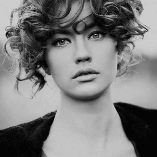
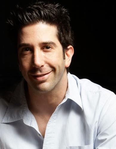
Alex James is a portrait photographer who's work also covers fashion and advertisement. I have chosen to research this image to show different outcomes of using a black background whilst shooting portrait photography. This shows that using a black background gives good shadow, whereas if this was shot against a white background, the shadow wouldn't look this good. I like this image because it shows plenty of light and plenty of shadow. Whilst shooting my final image I will take into account how this image is shot and the lighting and shadow and attempt to show this within my image.


I went into the studio and started to shoot my final image. Using the black background and having soft box lights either side of my model, making sure there is enough light reflecting into the sunglasses to show a reflection. Before starting I made sure that every piece of equipment was set up and positioned correctly, making sure my camera settings were correct and that my model was positioned correctly. I then started to shoot, experimenting with the angle and positioning of my model and their head. I shot from different distances, up close to slightly further away. I continued to produce a range of different images using all the techniques I intended to. Throughout this shoot I produced a range of good and not so good images. A couple of the images did not have enough lighting within the sunglasses, some have too much of a tilt within the model's head, and some are not positioned how I wanted them within the frame. However, this one image that I have shown shows everything just how I wanted it. Whilst shooting I took into account showing some shadow, but felt that it looks far better without shadow. To get the outcome I wanted, I positioned the model straight forward but tilted her head slightly to the right, therefore she wasn't just facing straight, which I think would make this image look boring, but her head isn't tiled too far which would make it look un-natural. I have done this so that it wouldn't look boring with my model just facing straight on, I feel with tilting their head slightly it gives a slight more excitement to this image. I have positioned the soft boxes so that the light is slightly shining in the sunglasses which gave me the ability to show reflection within the glasses. I have shown the reflection of light bouncing into the glasses and have also shown reflection of me taking the image, which I think has worked well because it is visible, there isn't too much light so that it just bounces straight off and shows nothing but light, it is just the right amount and enough to make someone look closer to see the details. I have also positioned the model in the frame giving a small amount of room above the head, so what when I start to turn this image into a magazine cover, it will be possible to add a title, and any part of this title that overlaps onto the model I will erase which will give the effect that the title has been positioned behind the model. Overall I am happy with this image, I feel that I have developed my idea and image well from my first shoot, I have used a fair amount of inspiration from my chosen artist and have used research to help me along the way to achieving my final outcome. I have produced a successful image that I am happy with and have took many steps to get to producing the image, and using the correct steps and correctly using Photoshop I will be able to produce a successful magazine cover.


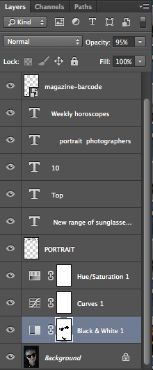
Moving onto using Photoshop to correct my image to how I would like to produce it as a magazine cover I started to experiment with different effect using adjustment layers. I started off adding the title, 'portrait', I made the text as big as possible to cover the top of the image which makes it look more professional, I chose a text that I like and I got the colour of this by taking a colour from my models hair using colour selection. Then I moved onto using black and white, I experimented with the different type of black and white effects and found one that I felt works and am happy with, I then changed the opacity to 95% to bring in a tiny amount of colour. I then, using the same layer, brought back colour into the sunglasses and the models t-shirt, which I did by using the eraser tool because it brings attraction to parts of this image with having the image black and white and some aspects of the image in colour. I then used the curves effect to bring in some light so that the image wasn't too dark. I then chose to experiment with the Hue/Saturation effect, at first it was just an experiment to see what it was like, but moving the hue bar along the different colours I found that it changes only the colour that I have brought back into the image from the black and white, and moving the bar up and down I found this blue/purple colour, which works better than the original colors because it makes the colour of the sunglasses and the models t-shirt, and also the title match up. It also mass the reflection in the sunglasses more visible. Lastly I moved onto adding the last features; the bar code to make this look like a professional magazine cover and also text around the image giving clues to what will be inside the image, making them big and exciting to make the reader drawn to this magazine. I have chosen a text that I think fits well and a colour that is visible over the top of this image. Overall, I think that using photoshop I have produced an image that portrays a successful magazine cover, I have used photoshop well, taking the correct steps and using the correct tools to turn this image into a successful magazine cover and have added the correct features.


Monday 3 November 2014

Health and safety

Health and safety in the studio is very important.

  • You must make sure there is no loose wires and make sure that they are tucked away so that there is no chance of you or any other person in the studio tripping over them, but if this is not possible you must make sure everyone in the studio is aware of the wires or use tape to secure them.
  • No food or drink is allowed in the studio because spillage could cause damage to equipment or it could cause a person in the studio to slip and fall.
  • When leaving the studio you must make sure that all studio lights are turned off, unplugged and to be taken back where they belong. This is important because if you leave the lights on for too long they could overheat and cause fire.
  • Also when leaving the studio you must make sure everything is put away correctly so that there is no hazards for the person using the studio after you. For example make sure nothing will fall off the top of a shelf or lights wont tip over. 
  • Whenever you are not currently using a light they must be turned off to avoid overheating.

Idea shoots


Idea one - Music photography
Whilst shooting this image I have used the inspiration of music photographer Nick Pickles. Choosing a particular image of his work I have taken inspiration of low key lighting being used and also using an object to show the genre of music, I have chosen to use earphones to show this. Experimenting with the lighting and the positioning of the model, and also experimenting with using a microphone as a reference to music instead of a earphones, I have gotten a range of different images which I have shown using a contact sheet, a range of them I like because of the positioning I have taken the photograph in, but the rest I dislike because there is too much or too little light. I have shown the image I have chosen to use to represent my first idea, which I will experiment with further using Photoshop to add a title etc and see what it would look like as a magazine cover. I have chosen this image because I like how balanced the lighting and the shadowing is and the position I have taken this photograph in. Also with there only being a small amount of light on the side of the face I think that gives this image a deep meaning, because a large amount of the face isn't visible, which gives the message that whilst listening to this music she is hiding her face and doesn't want to be seen. Within this image I have shown reflection within the lighting. I could improve on this by taking more inspiration from my chosen inspiration image and showing more action and movement with the model.


I have now developed onto adding magazine features to show how my image would look as a magazine cover. On Photoshop I have added a title and have taken a colour from the hair to use for the title, which I have done by using colour selection. I placed the title at the top of this image using a new layer and have used the eraser tool to erase parts of the title that were over the top of the model or any object in this image, which I think makes this image look more like a magazine cover. I have also added a bar code to give this image more of a magazine cover effect. I think that this image would look good as a music magazine cover because it represents music well and the shadow and the darkness would bring attraction. Although, I think that I could improve on this by making the title slightly bigger and adding text around the image to give it more of a magazine look, but overall I am happy with this image and how I have developed it.


Idea two - Portraiture

For my second idea I have chosen to use the inspiration of a portrait image taken by the portrait photographer Tom Barnes. I went in the studio and whilst shooting this image I used the inspiration of the style of the image taken by Tom Barnes and having the model wear glasses. Whilst shooting this image I have experimented with taking the photograph from different distances and different positions of the lighting, which I have shown in a contact sheet. In the end I got the outcome of this image which I am happy with and feel that I have used a good amount of inspiration from my chosen photographer.Using this image I will experiment with adding a magazine title and features to show how this image will look as a magazine cover. I have chosen to show reflections within the glasses in this image which I think works well because there is reflections of light and shadow. My inspiration image was a black and white photograph not colour, I will also take the inspiration from that and alter this image on Photoshop to give this a black and white effect that I am happy with and think will reflect well with the inspiration image. I could develop this image further by using a black background instead of white, using a good amount of light, not too much and not too little, to show a good amount of detail and also show better reflection within the glasses. I could also experiment with the position of the model and not just the lighting as a development on this image and a way to improve and move this idea forward.


I have developed onto adding a title and a bar code to this image. On Photoshop I have changed the effect of this image to black and white and also added a title using a text layer, I have made the colour of the title red to give it a bit of colour after editing the image to black and white. I placed the title on top of this image and using the eraser tool erased past of the title which covered the model which makes this look like the title is being the head of the model. Although I like this image the the contrast of the black and white image and red title go well together I am not sure that this image would go well as a portrait magazine cover and to develop this and make this image look better as a magazine cover I could experiment with the text and colours of this image.


Idea three - Fashion
For my final idea I have chosen to use the inspiration of a fashion image shot by Julia Kennedy. The inspiration I have chosen to take from Julia Kennedy's image is the fashion of wearing a backpack and within this I will show reflections of the bag within the mirror. Whilst shooting this image I have experimented with a range of different positions of the model, such as standing up and sitting and kneeling at different angles, which I have shown in a contact sheet. I have shown the final image that I am happy with and I like this image because I think that the positioning is good, as well as the positioning of the mirror that captures a good reflection of the backpack, I feel I have used a good amount of inspiration with my chosen artist and am happy with my final outcome. I will move on to add a title and magazine features onto this image using Photoshop to show how this image would look if it was to be put onto a magazine, which would be a fashion magazine. I could develop this image by reflecting more than just the backpack into the mirror or focusing more on the relfection than the model within the image. 


Developing onto adding a magazine features, I have used Photoshop to add a title, which I have done using black text and using the eraser tool to remove any text that has been placed over the model, and have also added a bar code to show features of a magazine cover. Although I like this image, and I feel with the right editing and adding to this image it could look good as a magazine cover, but I dislike the font and colour I have chosen to use for this title, to improve this I need to experiment with the font and the colour of the text and make sure I am happy with the ones chosen and feel that it looks more successful as a magazine cover. But I think with the right title and other magazine features placed in the correct places this image could be successful as a magazine cover.


Thursday 30 October 2014

Advantages and disadvantages of studio photography

There are many advantages and disadvantages of using studio photography, some are different for each different style of photography and some the same for all styles of photography. An advantage for any style of photography is that you can choose the type and amount of lighting you want whilst shooting the image, but on the other hand daylight can look a lot better than studio lighting. Whilst shooting still life photography for advertising using the studio has an advantage because not all objects belong outside, for example a piece of cutlery, they don't belong outside therefore using the studio is an advantage for this type of photography. Weather conditions can also be an advantage of using studio photography because if the weather conditions are bad, trying to photograph an item of clothing or anything delicate could appear to be difficult because it would be difficult to keep the objects still. Shooting in the studio gives you a limit on what you are able to do, for example it wouldn't be possible to throw water or any liquids about because of electrical equipment, or it wouldn't be possible to throw objects about because of equipment all around the studio which are disadvantages of studio photography. Another disadvantage of using studio photography is the space, in the studio there is a limited amount of space, it would not be possible to have anything up high for throw anything too far upwards because of the ceiling, and there is also a limit on how far back you can shoot and the amount of objects or people you can photograph, whereas if these kind of things where to be photographed outside on a park for example there would be more than double the amount of space to do these things. The scenery of a studio is also a disadvantage, using the studio gives you a limit on the scenery and background of the photograph, whereas photography outside there is no limit, you could choose a type of scenery you would like to use and go out and find it, there is a lot of choice of scenery outdoors but is limited within the studio. Shooting portrait photography in the studio has its advantages and disadvantages. An advantage is that the position of the lighting can be chosen, you can choose where you want the light to shine and where on the face you want light and shadow, but a disadvantage of this could be that if you don't want any shadow in the image it could be difficult to get rid of this. All in all studio photography has its advantages and disadvantages, it just depends on the type of outcome image you want whether studio photography would be an advantage or disadvantage.

Sunday 19 October 2014

Studio Equipment

Soft boxes
A soft box is an enclosure around a bulb, which is a type of photographic lighting device. Soft boxes are used to bounce light off a surface to defuse light. It can be used as either a continuous light source or a flash. Once positioned correctly, using a soft box can reduce shadow and give more light to the photographing subject.


Beauty dish
A beauty dish focuses give light towards a focal point using a parabolic reflector. It is mainly used in portrait photography in which the photographers use by pointing the dish downwards onto the model to bring out the models bone structures as well as the facial features, which also creates a nice shadow to distract unwanted skin flaws.


Flash sync
Flash sync is the synchronizing of the firing of the flash with the opening of the shutter. Flash firing too late or the shutter speed being too high causes a dark line of shadow at the bottom of the screen, to stop this happening the shutter speed has to be correct, but not too low which will cause the photograph to be over exposed because too much light is being let in.

Reflectors
Reflectors are used to reflect light onto your model or object you are photographing. This can be one of two, natural light or artificial light.


Backdrops

A backdrop is a usually piece of material hung, but can be anything that can be used to enhance the look of a photograph, and is used as a background of a photograph, in studio photography backdrops are usually black or white but can be any colour you choose or can also feature images. To create a nice image using a backdrop you must make sure that the backdrop and the lighting are working well together. These are usually used in a studio or outdoors.


Sunday 12 October 2014

Third idea - Fashion

For my last idea I have chosen to focus on the genre of fashion photography to create a magazine cover whilst showing reflection.


An example of a magazine I would use for this idea is a fashion magazine. Vogue magazine is a good example of a popular fashion magazine that my idea could go on and would work well with.


I have researched and found some fashion photography images on the internet. I have chosen these images to show different examples on fashion photography and the way they can be photographed. Some are close up and only show the top half and some are show more of the body to show the fashion. I like the image in the middle on the right because he is smiling and from researching I have seen that a lot of fashion photography images the model isn't smiling, I like that he is smiling because it portrays the image that he is happy in himself and in what he is wearing, and also the way his hands are joined and his body language make me believe that he is young and innocent. But I also think it works well when the model isn't smiling because it looks more serious and with the right pose represents the fashion well. If the model isn't positioned correctly I think that the clothing could become to look less important within the image, when this should be the main aspect of the image, the model is just there to show off the clothing and make sure it looks good. Fashion photographs like the one on the bottom left draw a lot of attention, because they are bizarre they attract peoples attention and the way the photographer has used colour in the background makes it look a lot more exciting than just a plain black or white background, which is what kind of background all of these photographers have used apart from this one image, the black and white backgrounds that have been used go well within those images but for this one a colour background works a lot better. The lighting in the top right images works well because it reflects off his face and brings attention the the fashion and the way he is dressed and what he is representing. Overall I like all of these images and think that in different ways they all work well as fashion photography.


Julia Kennedy
I have chosen to research Julia Kennedy's work and use her work as an inspiration to create a fashion photography piece because I like the style of her work and enjoy looking through her images. Throughout her work she has different themes of fashion photography but all fit into the same style and link together in a way.


I have chosen this image of Julia Kennedy's work as my main inspiration for my work inspired by image. In this image I like how the light shines through the top left hand corner and the position this image has been shot in.

Intentions
My aim is to create an image inspired by Julia Kennedy using this image as my main inspiration. I will attempt to do this in the studio and I will try to get the same lighting and using the same style of fashion to recreate this image as my own. Whilst shooting this photograph I will attempt to reflect this in a mirror to show reflections. When I am shooting this image I will also be experimenting with different lightings and angle to get different effects and will produce a range of images from which I will choose one I feel looks best.

Thursday 9 October 2014

Second idea - Portraiture

For my second idea I have chosen to focus on portrait photography to create a magazine cover showing reflection within the eyes.


Life magazine is a good example that fits well with portrait photography and is a good example of a magazine cover my idea could go onto. It is also a good inspiration in creating my images to look good once put onto a magazine cover as a lot of things have to be taking into account, for example having the portrait stand out whilst also having text on top.


I have found some images on the internet relevant to the genre of portrait photography. I have chosen these images because they are good examples of portraiture
. These images show different angles portrait images can be taken in, different positions the lights can be positioned in to give different effects and produces different shadows. Each of these have different facial expression which I feel reflects their mood and what they are feeling. The top right image shows a good reflection of mood with their body language and also with the lighting, how there is barely any light, only on the opposite side to what the image has been shot on which makes it look more like a silhouette, to me this is a deep photograph and I get the interpretation that he is deep in thought, whereas the top left one has a lot more light with some shadow in shows a happier mood whilst having a deep meaning at the same time. The bottom two images have a lot more light and a lot less shadow, I like these images and think that they look good because of the detail in the face, because there is more light and less shadow there is a lot more detail visible and I like these images as an overall portrait. I have researched and found that a lot of portraits are black and white and I think that in some situations this looks better than colour, it gives it a better effect and meaning.


Tom Barnes
Tom Barnes is a portrait photographer who works worldwide and is based just outside London. He has photographed portraits for music labels such as universal records and atlantic records, magazines, and many more companies such as specsavers, comic relief and many others. He has photographed celebrities such as Olly Sykes, Sam Smith, Example, Greg James and bands such as 5 Seconds of Summer and Deaf Havana.


I have chosen this image as my main inspiration of this photographers work and with this I will produce a similar image inspired by this piece of this photographers work. I enjoy this image because I think that it is an interesting yet simple portrait and it shows a lot of detail within his facial expression.

Intentions
My aim is to create an image inspired by Tom Barnes using this image I have chosen as my main inspiration. I will do this by going into the studio and I will show inspiration from this image within my image by also shooting and black and white and will shoot my model wearing glasses. In this I will show reflection within the glasses. Whilst shooting this image I will experiment with different distances and positions of the flash and have a range of different images and in the end I will choose which I feel works best.

Sunday 5 October 2014

First idea - Music

For my first idea I have chosen to focus on the genre of music to create a magazine cover whilst showing reflections within the lighting in the photograph. 


An example of a magazine this idea could be used for would be a festival magazine. I have found an example of a festival magazine, The festival guide, which matches well with my idea and shows that my idea could work well with a festival magazine.


On the internet I have found a range of different photographs relevant to the genre of recording and performing and enjoying. I have chosen these images because they have a good representation of this in many different ways such as the image of the man in the chair represents him being blown away by the music which I feel is a brilliant image and a brilliant representation and I really enjoy this image. I have also found other images such as photographs of musical equipment, microphones and guitars which are objects that are used whilst making and performing music. Although all of these images are a good representation of music and I enjoy them all, my favourites of these images are the images of live concerts, I like these images because they are showing a lot of people coming together to watch one or a range of different artists perform their music and all enjoying it together. The lighting's in all of these images have a big effect and I feel make the images look more appealing and show reflection, I like the way in all of these images everyone has their hands in the air and the way these photographers have caught this has a happy effect in these photographs because it shows everyone is enjoying themselves. Lastly in the third of images the way this photographer has caught the smoke coming out from the stage gives it a better effect and bring something different to the image and also is showing people holding and wearing glow sticks brings colour to this image, these two effects are the things that attracted me to this image and made me want to use it as an example.


Nick Pickles
Nick pickles is a London based photographer who covers gigs, festivals and events. He has been commissioned by companies such as Red Bull, The BBC, EMI, Disney, The Fly and many more. He is also currently working as the house music photographer at Wembley Arena and has previously worked on many other festivals. Nick Pickles style of photography is mainly based on photographing concerts and festivals which includes capturing a wide range of artists in the action of performing from many different angles and distances to create different styles of in concert photography and also photographs portraits of bands, his work has been used for artwork and marketing materials for private exhibitions.


This is the image I am choosing for as my main inspiration of this photographers work, my interpretation of this photograph is an artist in a dark room performing their song that means something to them, I enjoy this image because it is very dark and mysterious and he looks very deep into the song and in this image his hand body language and facial expressions shows that it means something to him. I think that I will enjoy attempting to re create this image and will try to get it as similar to this image as I can. 

Intentions
My aim is to create a piece inspired by Nick Pickles using this particular image I have chosen as my main inspiration, I will attempt to do this by going into the studio and using low key lighting as that is what is used in this image of Nick Pickles work. I will experiment with different exposures and re positioning the flash and the person I will be photographing, using reflection within the lighting, but instead of photographing landscape it will be photographing portrait so it is able to fit onto a magazine cover.

Tuesday 23 September 2014

Magazine covers and reflections


Magazine covers 

On the internet I have found a range of different magazine covers examples with two of the same music artists. I have found these to compare the similarities and differences in a selection of magazine covers. The Vogue and Vibe magazines both have their magazine names in the background and behind the photograph of the artist, whereas the Billboard and GQ magazine have theirs in front. My opinion is that it it looks better with the name behind the photograph as it makes the artist stand out more and make the magazine look more interesting, whereas when it is in front it puts the artist in the background and looks less appealing. A similarity of them all is that they all have the name of the artist on the cover with an appealing quote to make the reader interested and want to buy the magazine. The GQ and Vibe photographs are both close up and focus on the face, focusing more on the face and his facial expressions, whereas the Billboard and Vogue are a little further back and show part of the rest of the body which focuses more on body language and the way she is positioned.


I have now chosen two different genres of magazine covers, the first one being film and the second sport. The first one is very dark and mysterious, portrays that this magazine is advertising a very good action film and makes the reader want to pick up the magazine and also concentrates on the whole magazine and brings attraction to the whole of it not just one particular section, whereas the sports cover is bright and bald and focuses mainly on the person on the cover. These two covers are laid out differently, the text is in different positions which give them two completely different looks, the only similarity with this is that the titles are towards the top but the film cover has the title over the person and the sports one is behind. The two images of the people are both from different perspectives, the film one is a face portrait but the sports one is almost full length. A similarity about these are the facial expression of the two, this gives the message that the two are serious and it also looks mysterious. 


The last two covers I have chosen to compare are in the genre of food and health. Both of these magazines are based on getting/keeping fit and being a healthy person. The first one is based on healthy eating while the second one is based on keeping fit and healthy and exercising. Although these two magazines are based on the same genre the layout and everything about the covers are very different, to me there is nothing similar about these two magazine covers apart from the genre. The food one has photographs of food on the cover whereas the health one has a photograph of David Beckham. The first one has information down the right hand side and on the bottom whereas the second one has information down the left and a small amount on the right. Overall everything about these two covers are different apart from the genre. 


Reflections
My interpretation of reflection is reflections in glass and reflections in water. I have found some examples from the internet of what I think are good images of reflection. Firstly I have an image of a sunset and palm trees reflected on water, I think that this is a good example of reflections as it has a clear reflection in the water of everything that is above and it is a good image. I have also found an image of a reflection of a city-scape in a glass, I think that this image is clever with the way this photographer has taken the photograph upside down so that the reflection shows the right way round and has focused on the glass and made the background slightly blurred.