
Magazine covers
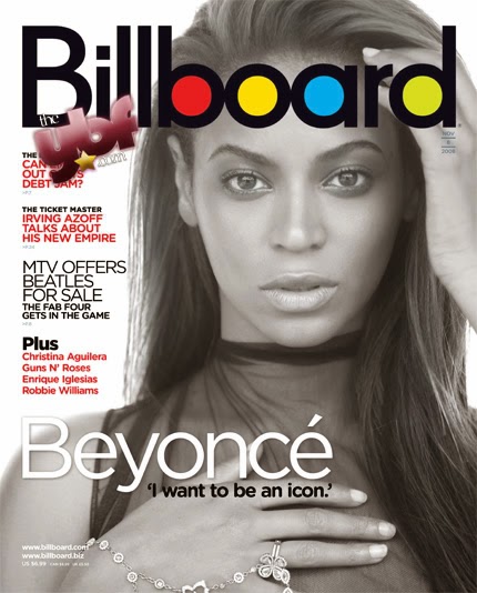
On the internet I have found a range of different magazine covers examples with two of the same music artists. I have found these to compare the similarities and differences in a selection of magazine covers. The Vogue and Vibe magazines both have their magazine names in the background and behind the photograph of the artist, whereas the Billboard and GQ magazine have theirs in front. My opinion is that it it looks better with the name behind the photograph as it makes the artist stand out more and make the magazine look more interesting, whereas when it is in front it puts the artist in the background and looks less appealing. A similarity of them all is that they all have the name of the artist on the cover with an appealing quote to make the reader interested and want to buy the magazine. The GQ and Vibe photographs are both close up and focus on the face, focusing more on the face and his facial expressions, whereas the Billboard and Vogue are a little further back and show part of the rest of the body which focuses more on body language and the way she is positioned.


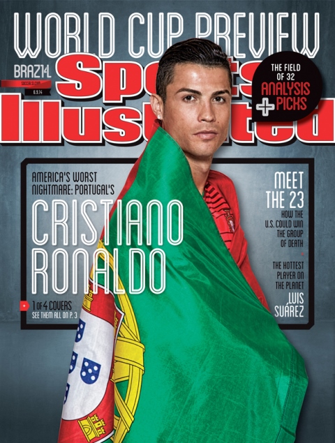
I have now chosen two different genres of magazine covers, the first one being film and the second sport. The first one is very dark and mysterious, portrays that this magazine is advertising a very good action film and makes the reader want to pick up the magazine and also concentrates on the whole magazine and brings attraction to the whole of it not just one particular section, whereas the sports cover is bright and bald and focuses mainly on the person on the cover. These two covers are laid out differently, the text is in different positions which give them two completely different looks, the only similarity with this is that the titles are towards the top but the film cover has the title over the person and the sports one is behind. The two images of the people are both from different perspectives, the film one is a face portrait but the sports one is almost full length. A similarity about these are the facial expression of the two, this gives the message that the two are serious and it also looks mysterious.


The last two covers I have chosen to compare are in the genre of food and health. Both of these magazines are based on getting/keeping fit and being a healthy person. The first one is based on healthy eating while the second one is based on keeping fit and healthy and exercising. Although these two magazines are based on the same genre the layout and everything about the covers are very different, to me there is nothing similar about these two magazine covers apart from the genre. The food one has photographs of food on the cover whereas the health one has a photograph of David Beckham. The first one has information down the right hand side and on the bottom whereas the second one has information down the left and a small amount on the right. Overall everything about these two covers are different apart from the genre.
Reflections
My interpretation of reflection is reflections in glass and reflections in water. I have found some examples from the internet of what I think are good images of reflection. Firstly I have an image of a sunset and palm trees reflected on water, I think that this is a good example of reflections as it has a clear reflection in the water of everything that is above and it is a good image. I have also found an image of a reflection of a city-scape in a glass, I think that this image is clever with the way this photographer has taken the photograph upside down so that the reflection shows the right way round and has focused on the glass and made the background slightly blurred.

